reynoldbot
Jupiter
A paper-white mask of evil.
Posts: 790
|
Post by reynoldbot on Dec 4, 2007 7:19:36 GMT -4
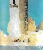
maxwellThose are indeed some very impressive paintings. You absolutely have your perspective and lighting down to a T. I could never hope to paint like that. It's all flat colors and accents for me! As requested, here is some Apollo-themed artwork: 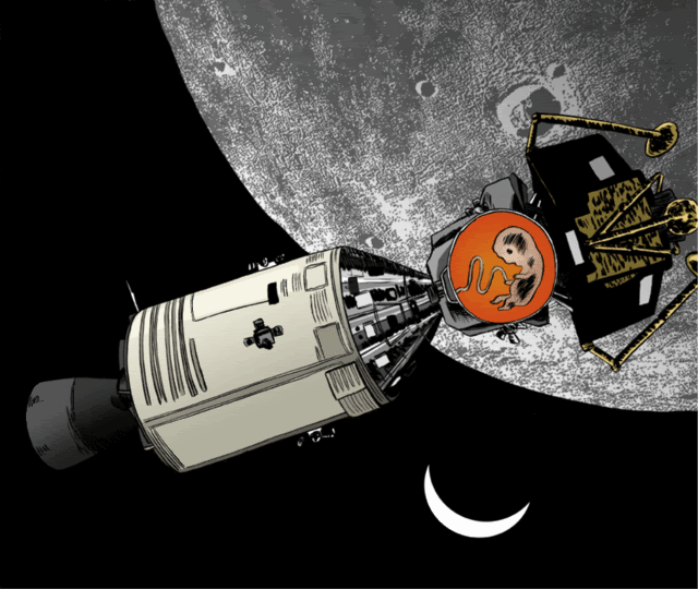 Al Al you should recognize this one: 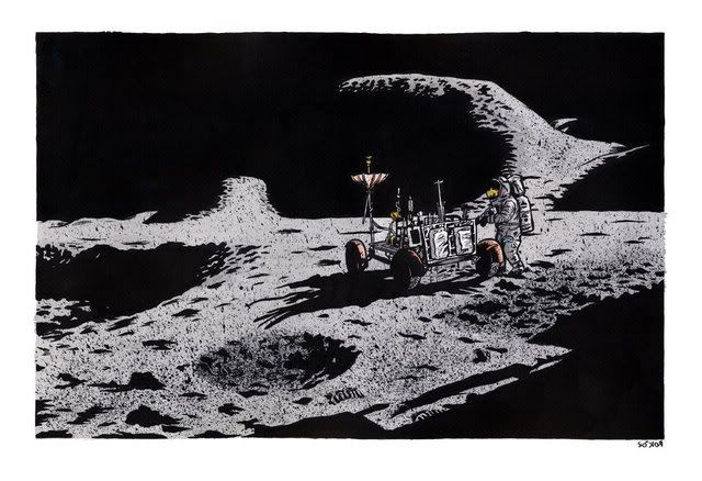  Some studies: 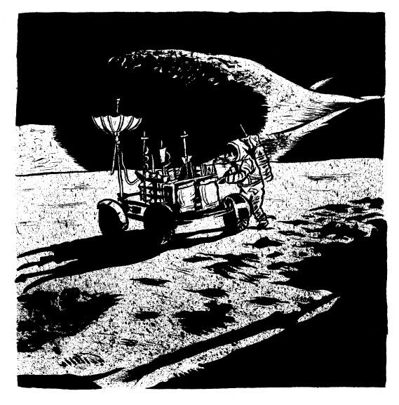 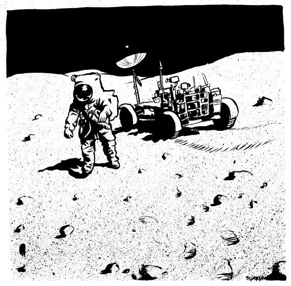 And some more ink experiments: 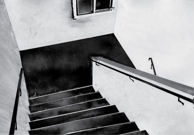 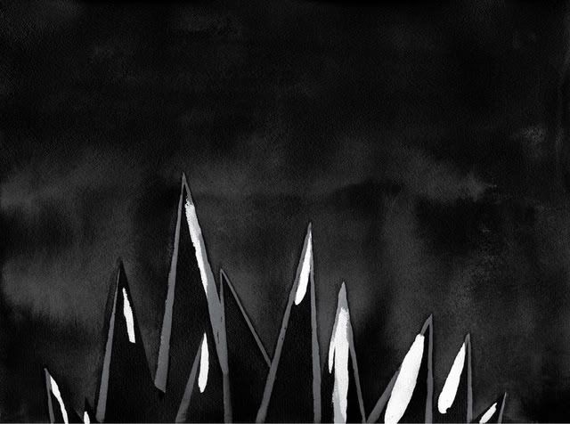 This is my most recent piece. It is the cover to a comic I'm working on: 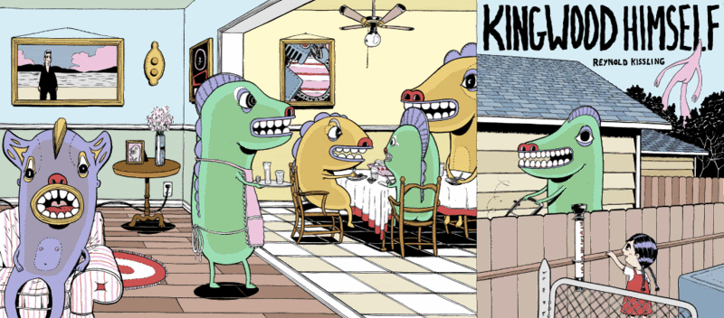 The color choices may seem weird to you, and there's a reason why. I colored this image with the intention to make a full color screenprint of it. Each color is in its own seperate layer (each layer corresponding to a layer I'd need to add to the screenprint) and I tried my damndest to keep the layer count below twenty. Much of the color variation you see is just multiple colors layered on top of one another. It took me about a month of solid nightly work to produce this, and it will probably take nearly another just to make the prints.
|
|
reynoldbot
Jupiter
A paper-white mask of evil.
Posts: 790
|
Post by reynoldbot on Dec 4, 2007 7:24:12 GMT -4
Photographed. The original canvas is 20X24 inches. I wish I had a better digital camera and I could get a better result. But here's the original (true original) photo that you can fool around with: i204.photobucket.com/albums/bb184/ginniegatrit/102_3297.jpgYou can crop it anyway you want. I'm not much of a photographer. Today I just propped the painting up on a chair on my porch and took a photo with my 3.2 m camera. I find that I have to apply some brightness/contrast adjustments in PhotoImpact to make it less washed out by the sun. I don't take a photo inside because of the flash reflection, and I don't have studio lights or anything. EDIT: Just some notes: It seems by the above photo that I need to clean the lens on my camera! I notice some waterspots or something. Also note that the WORST part of the painting in my opinion is when I ventured away from 'accident' - witness the yellow tail of the 'comet' in the top left corner, which I actually tried to shape instead of the technique used in the rest of the painting which was more haphazard and on-the-fly. To properly photographically document work is a real pain in the ass. I'm glad I get to just scan most of my work. I figure the best I could do with your original image (thank you by the way for posting it) is crop it and adjust the levels in photoshop. I can see what you are saying about the comet tail, but honestly I did not even notice it until you brought it up. The plethora of colors in the center really draws your eye and the comet just falls into the background. I gotta say, ginnie, that I love the look of the horse in that painting. You really do get a sense of age, like the horse is really working hard to keep pulling that cart. Very powerful. |
|
Al Johnston
"Cheer up!" they said, "It could be worse!" So I did, and it was.
Posts: 1,453
|
Post by Al Johnston on Dec 4, 2007 10:02:53 GMT -4
Al you should recognize this one: ;D |
|
|
|
Post by maxwell on Dec 4, 2007 12:47:31 GMT -4
Thanks for the kind words,
Portrait work is a pretty unique skill, I suck at it horribly as well. I suspect everyone has a knack, or natural ability for certain types of drawing or painting whether it's a subject or technique. People and most especially faces are the most difficult as the human face is probably the first visual thing we learn, long before language, we learn to read the faces of our parents. Assuming none of you were raised by wolves or robots of course. Everyone having such an acutely fine tuned visual map in their consciousness means that if you get an eye or ear in the wrong place by even a few millimeters, it'll stand out to the viewer. They may not recognize what the problem is, but they'll perceive that something is just not right.
And capturing expression and emotion is a whole different set of problems.
Things the viewer is less familiar with are often much easier as subjects, like spacecraft. You can stick odd shapes just about anywhere and not have a viewer perceive any "wrongness" about it. Much like how few people catch the little R2D2 figure stuck in the Close Encounters mothership scene at the end of the movie.
I like acrylics for the speed and ease of use, and have no particular favorites when it comes to brand. I know of some painters (notably John Berkey) will point out that commercial paints are designed more for shelf life than superior quality and grinds his own pigments to personal taste...er, preference.
I'd chew up old tire rubber for pigment if it would give me a little of Berkeys' cool brush style.
I've found that Liquitex and Winsor-Newton work well enough for me, Winsor-Newton having the best overall rating among painters I know. I'll use the cheap stuff too when I need, especially with the more expensive colors like the cobalts.
I shudder to think of some of the odd combinations of paints and inks and smelly sprays I mixed together have done over the years before I had a clue about what stable chemistry was. I'm certain there are a couple of pieces out there on somebodys wall doing double-duty as high quality flypaper thanks to some gunk I sprayed on it looking for an interesting finish.
I'm going to comment more on these images when I get some time, gotta go "push pixels for food" right now.
Good stuff posted so far, Not a bad composition among them!
More later-
M
|
|
|
|
Post by Ginnie on Dec 4, 2007 21:55:24 GMT -4
It took me about a month of solid nightly work to produce this, and it will probably take nearly another just to make the prints.
Boy, you've got a lot of patience.
I bought a silkscreen kit about four months ago and I've use it once on one of my daughters t-shirts.
My sister paints too sometimes. Kind of primitive, but really natural.
How long does it take her to produce a painting? She says "A bottle of wine".
Like your Apollo stuff too. I've been meaning to start one myself. Maybe I've been inspired...
Added:
Anyone have any helpful hints on photographing my larger works using no studio, no budget and a 3.2 megapixel digital camera? Maybe someway I could deflect the flash made out of homemade materials or something like that? Or is it better taking a picture further away - it seems like I can't get a proper rectangular shape to my frame when I'm close.
|
|
reynoldbot
Jupiter
A paper-white mask of evil.
Posts: 790
|
Post by reynoldbot on Dec 4, 2007 22:19:11 GMT -4
It took me about a month of solid nightly work to produce this, and it will probably take nearly another just to make the prints.Boy, you've got a lot of patience. I bought a silkscreen kit about four months ago and I've use it once on one of my daughters t-shirts. My sister paints too sometimes. Kind of primitive, but really natural. How long does it take her to produce a painting? She says "A bottle of wine". Like your Apollo stuff too. I've been meaning to start one myself. Maybe I've been inspired... Well, this cover was drawn for a comic I will be producing my final semester of college. It's my senior project and will be the centerpiece for my portfolio when I start looking for jobs. It has to represent my full artistic potential. Thanks for the compliment. Apollo generated a lot of incredible imagery to be inspired by. It's only a matter of choosing which aspect of the missions to reference! |
|
|
|
Post by Ginnie on Dec 4, 2007 22:33:31 GMT -4
Here's a work that I did about 25 years ago. Totally unsaleable. I don't know what to call it. A bit of collage, ink, plastic. It really startled me when I viewed the finished work. 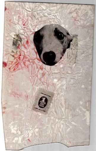 |
|
|
|
Post by Ginnie on Dec 4, 2007 22:49:44 GMT -4
Like I said, I'm terrible at portraiture. Most of them I throw away. A few returned okay results. Like this one of Sir Paul. But I have to draw from a photo - at least the subject doesn't move. ;D 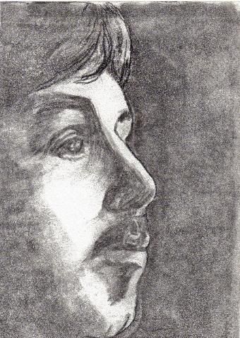 |
|
|
|
Post by Ginnie on Dec 4, 2007 23:10:45 GMT -4
Jay, I noticed that you linked to your picture instead of it appearing in the post. Is that how you would prefer we do it? Does it eat up bandwith?
Would it slow down the loading of a page for those on dialup?
|
|
|
|
Post by Kiwi on Dec 5, 2007 6:18:41 GMT -4
Anyone have any helpful hints on photographing my larger works using no studio, no budget and a 3.2 megapixel digital camera? Maybe someway I could deflect the flash made out of homemade materials or something like that? Or is it better taking a picture further away - it seems like I can't get a proper rectangular shape to my frame when I'm close. When I had a studio I used to photograph lots of photos and paintings etc. for artists, but I had a simple set-up that almost anyone could duplicate. Requirement No. 1 is soft, even, natural light. I never used even the big studio flash units and soft boxes etc. My studio was built around the early 20th century and had a large, frosted, south-facing window (north facing for you northern hemisphere folks), and I just set up the artwork at right-angles to it on the opposite side of the studio, against a wall, level with the right edge of the window and facing to the left. This produced no appreciable drop-off in light intensity from one side to the other of large artworks. Setting up at right angles to the window meant that neither I nor my camera cast shadows onto the subject. But you don't need a window like that. Outside on an overcast day will do nicely. Open shade on a sunny day is fairly useless for colour work because you'll get a blue cast from the sky or casts from other colours that the light bounces off, and any passing clouds will make exposure difficult. However, you might be able to fix that with filtration on the lens, or with coloured reflectors. On the other hand, I might be years out of date. Colour casts like that may not even matter with digital photography, although I suspect they could for accurate results. They do with film. Another way is to make your own "frosted window" of tracing paper, a lightweight white sheet or other materials fastened to a frame of wood or PVC pipe that could be used as a diffuser in direct sunlight. Requirement No. 2 is a simple way of getting the camera dead square to the artwork, and I had a simple setup of a board that was fastened to the wall and had regular patterns of squares, rectangles and diagonals radiating out from the centre, with a line on the floor lined up with the centre, over which I first placed the camera on a tripod, then used the pattern on the board for squaring up the view in the viewfinder. Most artwork could be temporarily stuck to the board with Blu-Tack, but heavy pieces in big frames needed some means of being propped up at the bottom. Requirement No. 3 was a soft white reflector for the right-hand side of the artwork for using if the window-light cast too much shadow on 3D artworks or acrylic paintings, but I hardly ever had to use it. A large sheet of polystyrene worked well for the reflector. On even fewer occasions I used a large mirror on that side to reflect the window light back if I needed a "hard" reflection. Requirement No. 4, which was rarely required but important when needed, was a polarising filter to remove specular highlights from acrylic paintings and other shiny artworks. Too much reflection can kill the colours. I never used a circular polariser so don't know how useful they are, just the conventional lined type. It's important to carefully ascertain just how much you must polarise a particular scene. Overdoing it can completely remove moisture on objects or kill off foliage by removing its sheen, so experiment to get to know how to best use one. A final accessory that's useful is a set of Kodak colour patches, grey scale and 18% grey card, or even some colour patches and greys that you've made up, but avoid glossy materials. These will help get the colour right in a reproduction if you don't have the original with you. Relying on eyes and brain only can produce very irate clients. Check your reproductions under natural light too -- tungsten and flourescent viewing-light can make you get them wrong. Dunno anything about using a 3.2 megapixel digital camera -- you'll need someone who's not such an old fart to help with that.  Just don't use flash on the camera because it's about the crappiest lighting ever, and don't use a wide-angle lens setting because you'll get distortion. Normal focal length to moderate telephoto is best for rectangular artwork, such as 50 to 100mm on a 35mm camera. I'd like to get a digital camera some day -- have taken very few photos since becoming an invalid. Moonlit landscapes are one subject I'd like to tackle. |
|
|
|
Post by Ginnie on Dec 5, 2007 20:16:20 GMT -4
I'll have to go over everything you said carefully. One thing I need to get is a tripod. I didn't even know if my camera would go on one but I just checked and it will. I imagine that I'm getting some blur from hand holding it.
|
|
reynoldbot
Jupiter
A paper-white mask of evil.
Posts: 790
|
Post by reynoldbot on Dec 5, 2007 21:49:51 GMT -4
ginnie
The portrait looks very nice. The only area that looks weird is the transition from the nose to the lips. They feel a bit like one fused object rather than seperate parts of the face. The lips appear to be as one, and their angle is a bit off (curving up when they would look more natural curving downward. Think in terms of perspective. The brow ridge points up to the left, whereas the nose being lower begins to point down to the left. The lips should follow a similar path.
|
|
|
|
Post by Ginnie on Dec 5, 2007 22:55:43 GMT -4
ginnieThe portrait looks very nice. The only area that looks weird is the transition from the nose to the lips. They feel a bit like one fused object rather than seperate parts of the face. The lips appear to be as one, and their angle is a bit off (curving up when they would look more natural curving downward. Think in terms of perspective. The brow ridge points up to the left, whereas the nose being lower begins to point down to the left. The lips should follow a similar path. Thank you , Reynoldbot. Considering that I suck at portraits, overall your comments are very positive. I don't even remember doing the piece - it was with a bunch of sketches I've done many, many years ago. What I noticed about the portrait is the lack of anything - shade, texture, wrinkle - in the left eye area. It's like I never completed that part or something. I know that proper training and practice, practice, practice would help me immensely in this area. Did I mention practice? |
|
Al Johnston
"Cheer up!" they said, "It could be worse!" So I did, and it was.
Posts: 1,453
|
Post by Al Johnston on Dec 6, 2007 6:49:38 GMT -4
Colour casts like that may not even matter with digital photography, although I suspect they could for accurate results. They do with film. Nearly all digital cameras can automatically compensate for White Balance to remove colour casts. DSLRs usually have additional WB settings for various lighting conditions (with some ability to fine tune them) and/or a facility to set the colour temperature manually and/or store a reference image for the camera to set subsequent images' WB to. For most purposes the auto setting is more than adequate. |
|
reynoldbot
Jupiter
A paper-white mask of evil.
Posts: 790
|
Post by reynoldbot on Dec 6, 2007 17:34:53 GMT -4
Colour casts like that may not even matter with digital photography, although I suspect they could for accurate results. They do with film. Nearly all digital cameras can automatically compensate for White Balance to remove colour casts. DSLRs usually have additional WB settings for various lighting conditions (with some ability to fine tune them) and/or a facility to set the colour temperature manually and/or store a reference image for the camera to set subsequent images' WB to. For most purposes the auto setting is more than adequate. I have kind of a cheap digital camera, but more often than not I have noticed that the color balance features only work moderately well. If you are really looking for a true balance then you will need to bring it into photoshop to adjust the colors. |
|

 Just don't use flash on the camera because it's about the crappiest lighting ever, and don't use a wide-angle lens setting because you'll get distortion. Normal focal length to moderate telephoto is best for rectangular artwork, such as 50 to 100mm on a 35mm camera.