reynoldbot
Jupiter
A paper-white mask of evil.
Posts: 790
|
Post by reynoldbot on Dec 2, 2007 8:16:18 GMT -4
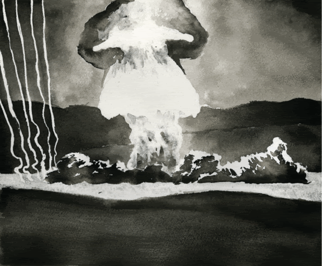
Yeah I had to teach myself not to do that because the lines became near impossible to erase and the indentions took the ink weird. I definitely see your point, so you'll be happy to know that no matter how good the ink and paper is, comic pages just won't last more than a few hundred years if they are kept well. I've seen pages that are only 50 or 60 years old and they looked like they would disintigrate if I touched them. But there is so much beautiful comic art going on it's a shame to see the original art get destroyed. Steve Ditko (who drew the first run of Spiderman among other things) used his old pages as cutting boards! A few years ago I traveled up to Columbus Ohio to see the Calvin and Hobbes gallery at OSU. It was a real treasure to be able to carefully study the original pages and I still reference some of the things I memorized to this day. Watterson did almost no preliminary pencil work at all; he would just sketch out the general composition and then go straight to final inks. Having original artwork is great for informing other artists on how the work is done. I really love seeing all that process laid out for everyone to see. Those are some real nice paintings, ginnie. The color and gesture are exceptionally nice. And since we're on the subject, I figured I'd post a recent comic page, so you guys get an idea what I'm talking about.  I sketched it with and HB and then did final pencils with a 2B, then inked it entirely with a #2 Winsor & Newton Series 7 sable brush (except for the panel borders which I drew with a nib). I lettered it with a felt-tip pen. Original size is 8"x10." Let me know if the image is too big. |
|
|
|
Post by nomuse on Dec 2, 2007 15:53:35 GMT -4
Mmm. Osaka-jo. I took a trip to Osaka just to see it. As I recall, though, only one of the gate towers is original; the rest is restored to various degrees. Still looks cool from the outside, though!
I like your style. Clear and realistic without being pretentious or too literal.
Where did you pick up your balloon style? Reminds me most of turn-of-the-century political cartoons...
|
|
|
|
Post by Ginnie on Dec 2, 2007 17:23:16 GMT -4
Where did you pick up your balloon style? Reminds me most of turn-of-the-century political cartoons...It sure has a tradition. BTW I'm reading this book right now: ecx.images-amazon.com/images/I/516ZFDG46ZL._SS500_.jpgI don't know if the illustration is a combo using a mixture of images, and if the type was done just for the book. I like the looseness of the balloon style though. Oh, also I've recently started to use Acrylic Ink, which can be combined with regular acrylic paint much more easily than regular ink. Helpful if you want to add details, fine lines etc. to your acrylic paintings. Its probably been around for years but I never seen till about a year ago. Can be used with a brush or pen.
|
|
|
|
Post by JayUtah on Dec 2, 2007 17:33:00 GMT -4
|
|
|
|
Post by Ginnie on Dec 2, 2007 17:53:50 GMT -4
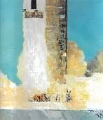
Wow Jay, you can do anything!  Very nice, you seem to have a careful and delicate touch. How big is the original? |
|
|
|
Post by JayUtah on Dec 2, 2007 20:28:21 GMT -4
Thanks! The original is about 7x9 inches. It was actually done rather quickly. He moved up his departure date so I had only an afternoon to do it, using for reference a dinky, crappy photo I took with my camera phone.
|
|
|
|
Post by JayUtah on Dec 2, 2007 20:33:52 GMT -4
BTW, my pencil technique is the one taught by architect Shin Takamatsu. He's who taught how to get great results with only three pencil grades and fine-toothed paper. The paper I used above was medium-toothed; the tooth is exaggerated by the relatively small size of the drawing. For production art I use whatever medium is appropriate, usually various combinations of spirit marker, watercolor, gouache, pencil, and ground pastel.
Edvard Munch used some rather ephemeral materials, raising serious concerns when his masterwork The Scream was recently stolen. His works are physically delicate.
|
|
|
|
Post by Joe Durnavich on Dec 2, 2007 21:16:10 GMT -4
|
|
reynoldbot
Jupiter
A paper-white mask of evil.
Posts: 790
|
Post by reynoldbot on Dec 2, 2007 21:40:07 GMT -4
I picked up from a variety of balloon styles. I certainly referenced old strips, mostly Little Nemo in Slumberland by Winsor McCay. My mentor, Vincent Stala aka King Mini, also influenced the look of my word balloons. www.kingmini.comThanks. Inking is my favorite thing to do. Your sketch is very nice. It has a good gesture and is soft and delicate, mirroring the nature of the figure's pose. |
|
|
|
Post by JayUtah on Dec 2, 2007 22:19:03 GMT -4
Dancers make wonderful subjects. Again, Degas was right.
|
|
|
|
Post by Ginnie on Dec 2, 2007 22:46:19 GMT -4
Dancers make wonderful subjects. Again, Degas was right. He sure loved those ballerinas. but he also said: One must do the same subject over again ten times, a hundred times. In art nothing must resemble an accident, not even movement.I guess there is a difference though in using accidents as part of your work or it looking accidental. Yeah, I think I understand it clearer. Was it Degas or Cezanne who said that the gendarmes (police) should go around and arrest all the Impressionists who painted en plein air(outside) ? Both were very exacting painters, a bit different than the regular impressionists of their day. Not that Monet wasn't very particular about composition, he just had more spontaneity in his work. Van Gogh must have horrified many painters with his speed. I don't know if this is a real quote or just from Lust for Life: Guaghin to Van Gogh: You paint too fast!Van Gogh replies: You look too fast! |
|
|
|
Post by nomuse on Dec 3, 2007 0:03:03 GMT -4
Once again I am struck by the odd connections between comic-book artists and skeptics. Seems like many of the people I know at John Byrne Robotics are also at James Randi's forum. Odd that you have to go to independent comics or web comics to find a respect for real-world science. In the latter, at least, there are a number of amusing strips (at least one avatar from which has made it to here...)
|
|
reynoldbot
Jupiter
A paper-white mask of evil.
Posts: 790
|
Post by reynoldbot on Dec 3, 2007 2:55:23 GMT -4
I find that strange too considering how many more opportunities there are in mainstream comics to implement or at least reference real world science. I read a Superman book just the other day in which Superman was thrown into the moon. In the panel, the moon was a featureless white disk save the cracks superman made as he plunged into it, and the curvature was readily apparant though the view couldn't have been more than several hundred feet. Then, you see a view of him flying above the moon looking out to earth, and the earth is a giant disk, implying that the two are much much closer than they actually are. Finally, he reaches Earth again and looks up and the moon is like breaking in half or something. Again, the moon was totally featureless save the cracks made by him. Totally retarted.
Programs like Futurama, which uses science and math to its advantage, become so much more enjoyable because they can be so layered in their humor and storytelling. Futurama says "our fans are intelligent" and treats them so. Marvel and DC says "our fans are fanboys" and treat them like gullible sheep.
|
|
|
|
Post by nomuse on Dec 3, 2007 5:37:11 GMT -4
In defense of the comic books, scale, relative scale, and velocities of the real environment make it difficult to set up the kinds of shots you'd like to in order to tell the story. Try to put into a panel "moon orbiting a planet" or "ship going from planet to moon" or "ship coming down from orbit" and the urge is to actually show those specific objects. Which just don't fit in frame together.
Hard to turn your expectations and show "moon orbiting a planet" in some other way than a big planet and a big moon in the same panel looking for all the world like a pair of christmas ornaments in a box. As in, maybe a cutaway to an orbit depicted, or a chesley bonestel "Jupiter from Io" sort of thing (sorry, too late and too tired to spell names properly), or a dialog snippet, or something.
|
|
reynoldbot
Jupiter
A paper-white mask of evil.
Posts: 790
|
Post by reynoldbot on Dec 3, 2007 7:09:56 GMT -4
That's a given, and definitely not my main concern with that sequence. I was just baffled that the artist couldn't be bothered to draw in some surface features of the moon, and that they resorted to an extremely exaggerated curvature. But it still bother's me a little that the artist drew the earth as if it was right next to the moon. In my opinion, if they wanted to really show just how far Superman was punched, they'd show in one big panel him standing on the surface of the moon looking back at earth in a realistic scale.
|
|