|
|
Post by Ginnie on Dec 1, 2007 14:55:54 GMT -4
Since art discussion is hijacking another thread, I thought I would start this one to discuss all things that could loosely be described as "Art Talk": Art History, Materials, Projects, How-To's and the like. I'd like to ask for some advice in the following area: I paint using Oils or Acrylics. I like Oils because they are opaque, but don't like how long it takes to dry. I like Acrylics because they dry fast, but aren't that opaque. I sometimes am frustrated it when I lay down paint and I can see through it. I like to be spontaneous and quick, but hate going over and over and over a section of canvas to have the colour blue or whatever. Is there a paint out there that is easy to work with (water based), dries relatively quick (within 20 minutes or so) and is opaque? The only way I seem to be able to use acrylic this way is to lay down a very THICK layer of paint. Now sometimes I like the transparency of Acrylic so I can do stuff like this: 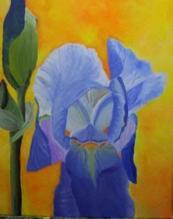 Acrylic 16X20" The paint lended itself very well to creating the delicacy of the petals. And the blending worked well. (BTW thats not an Alien with a spear, but a Bearded Iris (If I remember correctly). But I have problems with Oils because I'm lazy (my brushes get ruined because of lack of cleaning) and when I work fast I tend to get all my colours mushed up together as can be seen here: 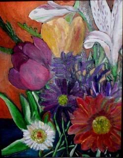 Oil 11X16" I can only look at that one for brief periods of time! And FINALLY, an example of one of my paintings where I was able to use Acrylic, but because I had to go over and over it to make it opaque, it became tedious and uninspired:  Acrylic 16X20" Funny thing about that one is that I had spent three hours on the sky, cursing my bloody paint - then completely painted it over using thick layers of paint that took me fifteen minutes... So I guess my question is: I want fast drying, opaque, water based paint. What to use. I've heard of Water Based Oils but have never used them. I don't want to go out and invest in another set of paints if I don't end up using them. What are they like? |
|
|
|
Post by echnaton on Dec 1, 2007 15:17:19 GMT -4
No answer for your question, but that is great artwork. I love going to museums to look at paintings. When traveling I make a special point to visit museums, galleries and churches, sometimes to the dismay of my wife. But I've seen great art all over the world.
My art output is limited to two painting and one drawing made under the guidance of a very skilled teacher when I was in middle school. She was such a great teacher she made the students feel they could do anything and with her help they could.
|
|
|
|
Post by Ginnie on Dec 1, 2007 15:39:56 GMT -4
She was such a great teacher she made the students feel they could do anything and with her help they could.
Most people are really intimidated when creating art. They think, "I can't draw" or "it will look terrible",
I always tell them they don't need to be able to draw well. And if it doesn't turn out that "good" (which is so subjective anyway), it doesn't matter.
Painting is so much different from drawing anyway. Take a look at abstract paintings - although some do require great technical skill, a lot can be accomplished by just using your imagination and using basic shapes, Combine that with the fun of using different colours, and you can have a win-win situation.
I really enjoy looking at children's art because it is so inhibited: no rules to hold them back, the abandonment of discipline and the outburst of their creativity.
And art is everywhere: in the cracks of sidewalks, on leaves, rocks, in the sky and the textures of bricks or stucco. It all depends on how you look at it.
Art can become too intellectualized sometimes - it doesn't always have to have a meaning to it. You've probably heard about paintings being hung upside down in museums or in one case where an abstract was hung with the wrapping still on.
When I paint, there is an intellectual journey happening, interesting enough more so with abstract. Which is why I find abstract painting sometimes the most difficult work to do of all - too much thinking!
I've never tried drip painting yet, though Pollack seemed pretty intense when he did his.
|
|
|
|
Post by wdmundt on Dec 1, 2007 17:21:15 GMT -4
I also have little to add of a constructive nature. I am several not-quite-opaque coats of green with envy at your talent and work, however.  I didn't take any art classes in high school or in college - and I wish I had. I've thought from time to time about going back to do just that. I taught for 6 years at Iowa State University - which has a pretty decent art and design college -- but never thought about doing it then. Will you post more of your work? |
|
|
|
Post by Ginnie on Dec 1, 2007 18:25:41 GMT -4
I'm really glad that people here like my artwork. It's always good to get positive feedback on work you've created. I have a temporary website here: pauljhalley.110mb.com/index.htmlIt certainly isn't very sophisticated and needs a complete overhaul but it works for now. Of course, everybody will know my real name but what the heck. Oh, and no, I am NOT that Paul Halley! ;D |
|
|
|
Post by lionking on Dec 1, 2007 18:38:02 GMT -4
|
|
reynoldbot
Jupiter
A paper-white mask of evil.
Posts: 790
|
Post by reynoldbot on Dec 2, 2007 8:28:38 GMT -4
Nice work of course. Tempera is very easy and quick to use, and doesn't have that plasticy look that acryllic gets. I personally love using gouache. It is extremely versatile, easily going between completely opaque and transparant like watercolor, and it mixes easy and dries fast. The downside is that if you layer on top it can get reconstituted and start mixing with the layer on top, so you have to be very deliberate with how you paint. Gouache is best for flats and small details: painting without a ton of layers.
I've had a hard time getting a response when I post artwork here, so I'm a bit jealous that the members are taking so well to your work :-)
I've got an apollo-themed screenprint over in general discussion if you guys are interested. The life of an artist is spent schmoozing.
Oh yeah and my avatar is an inkwash I did. The entire process involved dripping ink into deliberately shaped pools of water.
|
|
reynoldbot
Jupiter
A paper-white mask of evil.
Posts: 790
|
Post by reynoldbot on Dec 2, 2007 8:35:14 GMT -4
Here is my avatar: 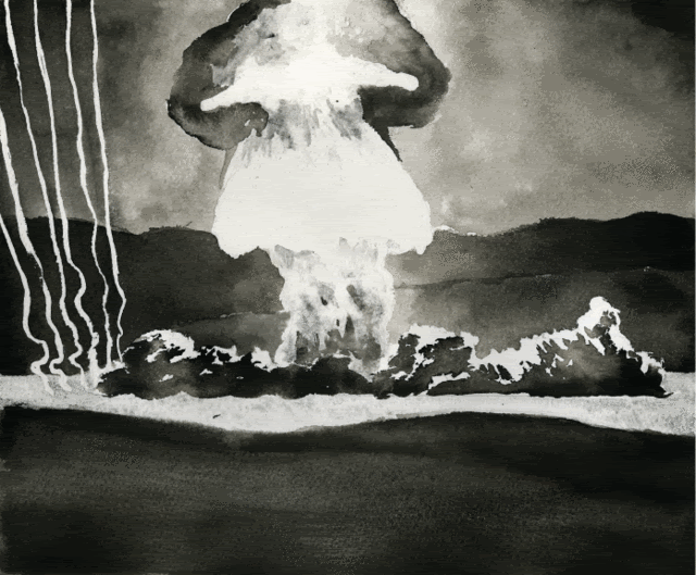 And here is another one done with the same process:  |
|
|
|
Post by Ginnie on Dec 2, 2007 17:03:16 GMT -4
Nice! It's interesting that you mention washes and 'pools of water'. I haven't done a lot in ink. I've done a few similar things using Chinese brushes and an ink stone. I even tried a few things using acrylic paint. This picture was created by laying it flat, dripping 'pools of water' mixed with various degrees of acrylic pigment. I flicked 'stars' and such on it with a toothbrush and regular brushes. I would gently lift up the canvas and roll the pools to mush into each other and get interesting 'nebulae'. I also dripped in some coloured ink into the acrylic pools. It was great fun to do. But I couldn't control it precisely - I tried painting the Horesehead Nebulae this way and it came out terrible because I had to have a definite composition and shapes. This completely took out the randomness and spontaneity. 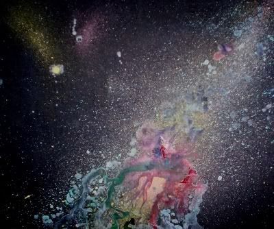 Acrylic, Ink, Acrylic Ink 20X24" A bigger version can be found here: i204.photobucket.com/albums/bb184/ginniegatrit/nebula1.jpgIt's great that artists can use similiar techniques but end up with totally different results. I like your work. |
|
reynoldbot
Jupiter
A paper-white mask of evil.
Posts: 790
|
Post by reynoldbot on Dec 2, 2007 21:56:02 GMT -4
oh wow, ginnie, that is really beautiful. I employed similar techniques as you did, picking up the paper and moving it around to get the ink to do what I wanted. I used two different kinds of inks, which would do two totally seperate things when dropped into water. That painting reminds me of the paintings done for The Flaming Lips album covers: upload.wikimedia.org/wikipedia/en/5/51/Mystics.jpgI think I may use that painting for my desktop background. Is that scanned or photographed? |
|
|
|
Post by Ginnie on Dec 2, 2007 22:12:18 GMT -4
Photographed. The original canvas is 20X24 inches. I wish I had a better digital camera and I could get a better result. But here's the original (true original) photo that you can fool around with: i204.photobucket.com/albums/bb184/ginniegatrit/102_3297.jpgYou can crop it anyway you want. I'm not much of a photographer. Today I just propped the painting up on a chair on my porch and took a photo with my 3.2 m camera. I find that I have to apply some brightness/contrast adjustments in PhotoImpact to make it less washed out by the sun. I don't take a photo inside because of the flash reflection, and I don't have studio lights or anything. EDIT: Just some notes: It seems by the above photo that I need to clean the lens on my camera! I notice some waterspots or something. Also note that the WORST part of the painting in my opinion is when I ventured away from 'accident' - witness the yellow tail of the 'comet' in the top left corner, which I actually tried to shape instead of the technique used in the rest of the painting which was more haphazard and on-the-fly. |
|
|
|
Post by maxwell on Dec 3, 2007 9:49:55 GMT -4
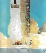
Wow, You run into fellow artists in the oddest places. Nice work! Ginnie, you might be able to solve some of your transparency issues by reading up on underpainting. Working up the values in a single color and blocking out areas where you want transparency/opacity. Reynoldbot, cool image, do you have more Apollo related work? I can never get enough. I could never get the hang of gouache, Re-wetting it always kept it moving around. One of my favorite illustrators, Syd Mead is a master with it. I always tended to layer it up too thick and make it brittle. Nothing like having a chunk of the foreground fall off to make your day. Love the sheer density of the pigment though. I spent many years working in acrylics, as an illustrator speed was always essential. While nothing beats the way oils handle light, it was just too long a process. My limited experience with waterbased oils was less than satisfactory, you could get an oil-like effect, but not enough to make it worthwhile and the pigments were not as strong compared to linseed based paint. I found that working up layers of acrylics and then glazing in the detail with layers of oils I could get the best of both worlds. Sometimes just a final varnish with an oil base often made the flat acrylic work really come alive, but photographing it first avoided the difficulty of dealing with lighting glare. Here's a couple of very old pieces in acrylics-  Beanstalk Ferry  The Venus Experiment I do a lot of technical type work, mostly space subjects, and often find I have the most trouble "loosening up" from a photorealistic style to something more painterly. Getting into 3d modeling and rendering did nothing to help that either. One of the more interesting tricks I learned from an artist who's best known for his horror illustration is painting with a plastic bag. Puddle up some color, (I always preferred tossing runny white paint onto a black board and glazing in color later) and spray it liberally with water. Then take a trash bag or plastic wrap and lie it down on top. squish it around a bit, then pull it off. The patterns it creates are quite wonderful and can be altered by adjusting the squishing, the speed at which you remove it, or sliding the plastic around. If nothing appealing turns up, you can lay the plastic back down, add more paint or water until something interesting turns up. The guy who taught me that had a real knack for drawing out the shapes and patterns created into something representational, and usually pretty creepy. But it's an interesting and creative way to see what your eye can pull out of the patterns you create. The effect can be quite different if you use aluminum foil instead of plastic. Letting a board dry and the repeating the process can have interesting results too. It's also a great technique for craft type projects too, I've introduced it to some folks that have done it on things like furniture and motorcycles. The only example I have of using it in a illustration was in the background of this piece from a series illustrating "Frankenstein". I made up several patterned boards and worked up the foreground on top of them, which added an interesting consistency to the series of pictures.  The Secret Same fellow had a unique way of creating nebula and other "stellar" type effects. Lying a board flat and pooling up some semi runny colors in the center and then blasting it with air from a shop vac. (You need the type that'll let you hook the hose on the output.) This made some pretty amazing and organic looking effects that would take forever to render by hand, and would end up looking sort of stilted if you tried. Always had a real creative time hanging out with him except for the fact he didn't metabolize ethanol very well.... I hope to get back into painting in the coming months, digital work is great and I really don't miss the mess, but with traditional media you do know when it's done. Much more than digital work which often feels to me like it could just go on forever. And digital work allows me to produce works at a pretty alarming rate....till the power blinks, and you get to start from scratch. Here's one more in acrylics from the STS-47 mission brochure-  The 100 Ton Glide Great thread! Post more work! |
|
Al Johnston
"Cheer up!" they said, "It could be worse!" So I did, and it was.
Posts: 1,453
|
Post by Al Johnston on Dec 3, 2007 14:55:26 GMT -4
Et tu Maxwell ;D
|
|
|
|
Post by nomuse on Dec 3, 2007 16:50:18 GMT -4
I got nothing.
But I will say that I am very tempted to think of 3d as a trap. Scratch that; for certain artists, encountering certain commercial 3d packages too early in their learning curve (shh -- Poser!) is most definitely a trap.
|
|
|
|
Post by Ginnie on Dec 3, 2007 20:01:52 GMT -4
Maxwell, you have a lot of skill indeed. And patience too I would guess. I'm amazed at the detail, I'm not very good at precision. Thus, I suck at portraits - I mean really bad. So you like acrylic? Is there a brand that you prefer over others? I'm always on a budget so I cheap out too much. But its not worth it because I have to struggle so much to achieve results. For one time I wish I had the patience to do a really detailed painting, but so far either I get bored, or I'm trying to catch up to my 'vision' if I have one. I'm really enjoying this post because I get to indulge in art discussion and view other people's work. That's hard for me to do normally. SELF INDULGENT STORY - SKIP IF YOU WANT I'm going to post a picture and tell you a story. It illustrates how 'accident' or chance changes the direction and final result. I found an early 1900's photograph in a book of a horse hauling a cart along a street in St. John's Newfoundland. The horse intrigued me because I'd never painted one so I thought I would give it a try. So I painted the photo and it ended up a mess. Oh, the horse was fine, but the background was awful. I have problems with architecture and straight lines. So here I go, with grey paint - painting out all the buildings in the picture. I had this almost completed when a dash of orange from the building sprung out at me. Looks like fire, I thought. And that inspired me to turn the dull grey overcoat into a swirling mass of fire and smoke. The horse then took on a personality. He was hauling the driver and cart out of danger. This old, mangy horse, probably had a rough life, nearing the end of his days. One of his last tasks - to rescue his master and get home safe. Then I knew the horse, as if he really existed. My favourite painting that I've done, and don't ever want to sell. I had it in a gallery for awhile and doubled the price so no one would buy it. As if I would be so lucky to sell one anyway... 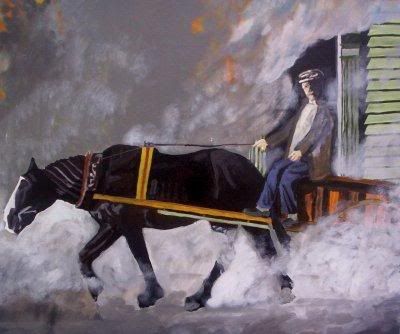 You can tell on the right side how weak my rendering of the building actually was! Anyway, I love it when a painting takes on a life of its own - outside my planning and expectations. You wonder where it comes from when that happens. |
|