reynoldbot
Jupiter
A paper-white mask of evil.
Posts: 790
|
Post by reynoldbot on Jan 8, 2008 20:14:20 GMT -4
I guess one more concern I have is that the text you created in that bar does not correspond directly to the images of the page. This can be a good thing, but I would consider either adjusting the images in the page or the text so that they together tell one story. Of course, you want to avoid "see and say" panels (i.e. in one panel the caption reads "Superman is punched through the empire state building!" and the image consists of superman just being punched flying through the building), so there certainly can be some leeway between text and image. I guess what concerns me is that the text tells the story of the landing, whereas in the page they have already landed by panel 4, and are already out exploring before the page is done.
Sometimes I get stuck when I don't know how to figure out what should be told visually and what should be written out. I always try to remember that the text and image should work together to form the story. A good comic page will fall apart if one is omitted.
|
|
|
|
Post by Ginnie on Jan 8, 2008 20:27:14 GMT -4
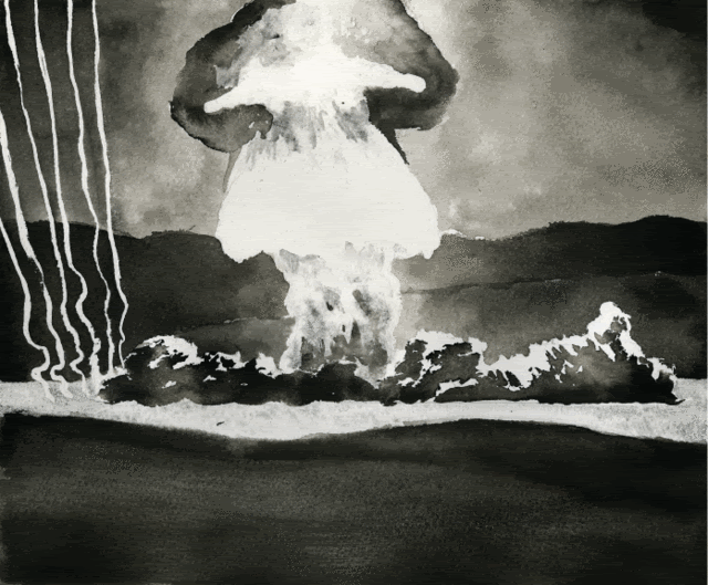
Compositionally this works pretty well, except that the right side is almost totally ignored throughout most of the page. If you'll notice, you could crop a considerable amount off of the right side and not lose hardly any informationHmm, I don't know about that. I think showing the smoke from the rockets blast is important. You get a better idea of the force involved to lift the rocket into space. In fact, I especially like the picture of the Apollo 11 blastoff where the rocket is but a small portion of it - the smoke and blast itself takes up over half of the picture. I'd scan it in to show you but I'm in LInux right now and the Lexmark all-in-one Scanner doesn't work. I agree, including the smoke is pretty important, but I still contend that too much of the information on the page is constrained to the left side. There are a variety of ways to solve this problem that do not involve cropping the smoke out of the image. Oh, I agree! I didn't put much thought into the layout except that I wanted to show a few stages of the liftoff. |
|
|
|
Post by Ginnie on Jan 8, 2008 20:37:52 GMT -4
I guess one more concern I have is that the text you created in that bar does not correspond directly to the images of the page. This can be a good thing, but I would consider either adjusting the images in the page or the text so that they together tell one story. Of course, you want to avoid "see and say" panels (i.e. in one panel the caption reads "Superman is punched through the empire state building!" and the image consists of superman just being punched flying through the building), so there certainly can be some leeway between text and image. I guess what concerns me is that the text tells the story of the landing, whereas in the page they have already landed by panel 4, and are already out exploring before the page is done. Sometimes I get stuck when I don't know how to figure out what should be told visually and what should be written out. I always try to remember that the text and image should work together to form the story. A good comic page will fall apart if one is omitted. As far as the text goes, I was going to just type gibberish in it just to show visually what it would look like. Instead, I grabbed some text from a web page. Realize too, that these pages started out as a 'funny', not meant to be a real comic. They are more of an indication of what could be. I'm not seriously going to tackle this project - the technical parts alone (as far as information etc.) is beyond me. I like your suggestions, it would be visually more interesting to look at and more effective because they way I did it, you are either reading the comic or the text sidebar. Your way combines it all so that the whole page flows much better. The basic layout of the third page I stole from a comic book - thus the improvement? ;D In fact the whole thing is stolen: the pictures, the effort (computer vs. hand), the layout ... I wouldn't call it the most original effort! I just might though ink one panel by hand and see what results I get. One more question, what do you use to colour your work? |
|
reynoldbot
Jupiter
A paper-white mask of evil.
Posts: 790
|
Post by reynoldbot on Jan 8, 2008 21:41:09 GMT -4
Ah, so it acted more as a placeholder. My mistake.
I think the sample pages you have provided show a strong start. In my opinion, you have just about all you need to pull it off.
That's a good point. Integration here is key. Composing pages and especially individual panels on a page is difficult and laborious, because though you want each panel's composition to be successful on it's own, it is more important that it serves the entire page. One panel's composition must lead the reader's eye to the next. Perhaps inadvertently your third page has very good composition from panel to panel. It follows the "Z" pattern that comic artists strive for in their pages.
What comic did you take the layout from? Your layout is a basic three-tier grid. It is a classic layout that works universally and establishes a good, consistent pacing. The way you also choose which panels are large and which are small works very well. I used the three-tiered grid for years and have just recently began using other layouts.
What makes a comic original is more than just technique and materials. Storytelling is the most important part of comics, and if you find a unique way to tell the story of the Apollo 11 astronauts then it's not so important whether your visual techniques are very original.
Rotoscoping might get you some interesting results. I would recommend tracing the photographs loosely in pencil, then putting the photograph away and completing the image in the ink stage largely using your imagination (it might be wise to go back to the photo for specifics and facial expressions). That way your personality as an artist shines through.
I color my work different ways using different mediums depending on many factors. I used to use watercolors often in the past. Ink drawings seem to go hand in hand with watercolor. See some of Bill Watterson's watercolors as an example of that. More recently, I have been using gouache for color, then I ink on top of it. Most often however, time constraints force me to use the computer to color my work. I use photoshop. I scan in my work at 600 dpi, apply a threshold to it to convert it to black&white, then I create layers for each color I add. This allows me to change whatever I want without forever repeating the edit-undo keys. I have a wacom tablet which allows me to create organic color shapes and expedites the process.
I really like flat colors. I don't include a lot of gradients or textures into my coloring, because I feel that stuff to be gimmicky, unnecessary and worst of all ugly. Modern comic book coloring is almost universally awful, over-rendered crap. Plus, textures and gradients make pages harder to read. Watercolor, gouache, and photoshop are great for flat simple colors.
The best comic book coloring I have ever seen (outside of Calvin and Hobbes) is "Isaac the Pirate" by Christophe Blaine.
|
|
|
|
Post by Ginnie on Feb 3, 2008 21:26:53 GMT -4
|
|
reynoldbot
Jupiter
A paper-white mask of evil.
Posts: 790
|
Post by reynoldbot on Feb 4, 2008 21:00:41 GMT -4
That's a pretty awesome drawing. I especially like the heavy metal font for Cassini. Rock n Roll.
|
|
|
|
Post by JayUtah on Feb 20, 2008 0:57:09 GMT -4
Mm, just saw the Guggenheim Hermitage gallery in the Venetian in Las Vegas. Some very nice Picassos and a few good Impressionists too.
|
|
|
|
Post by Ginnie on Feb 20, 2008 17:25:29 GMT -4
Lucky you.
Our local art gallery sucks most of the time.
More interesting are the local gallery shops.
The best one in town closed unfortunately. I sold a painting there. ;D
I should be touring the city and find some places to hang some works, but I've been so darn lazy of late. It being February in Canada doesn't help.
|
|
|
|
Post by JayUtah on Feb 21, 2008 2:20:52 GMT -4
Well the Guggenheim-Hermitage is hardly a local gallery: an hour by plane or five hours by car from my house. But I'm fortunate to live within striking distance of some galleries that attract world-class exhibitions. I think it's safe to say I've seen as many Impressionist works in Las Vegas as I've seen in Paris. Some works just beg to be seen in person, as no reproduction can do them justice. I'm more excited about next month's trip to Washington DC, where I hope to have time in my schedule to check up on the National Air and Space Museum. But that's art of a different sort, I suppose.
|
|
|
|
Post by Ginnie on Jun 4, 2008 21:58:13 GMT -4
|
|
reynoldbot
Jupiter
A paper-white mask of evil.
Posts: 790
|
Post by reynoldbot on Jun 5, 2008 2:04:58 GMT -4
It's definitely art, but I would say the process is way more interesting than the product. It's pretty obvious (seeing as how he creates two nearly identical paintings in the two videos) that he just memorized a routine of tricks. I just graduated a few weeks ago with a degree in comic art. I'm putting up my website now: my senior project entitled Kingwood Himself is currently up in its entirety. www.reynoldbot.com |
|
|
|
Post by JayUtah on Jun 5, 2008 16:01:51 GMT -4
Congratulations!
I'll have to watch the YouTube videos later as my current location filters that site out.
As for speed in rendition, I think that depends on many factors. Certainly for a commercial artist, getting the job done by the deadline leads to one's ongoing commercial success. Whether fine art benefits either from haste or from meticulosity depends on the artist, the medium, and the intent.
Alexander Calder, it is said, could turn out wire sculptures of great appeal in mere minutes. I have seen the work, and honestly I can't imagine spending more than a few minutes on it. I own minimalist pen and pencil works that honestly can't have taken more than five minutes to create, yet have (to my taste) enduring aesthetic quality.
Then there are the Sistine Chapel style works. I can't imagine hurrying through those.
|
|
Al Johnston
"Cheer up!" they said, "It could be worse!" So I did, and it was.
Posts: 1,453
|
Post by Al Johnston on Jun 6, 2008 5:51:55 GMT -4
I just graduated a few weeks ago with a degree in comic art. Congratulations ;D |
|
reynoldbot
Jupiter
A paper-white mask of evil.
Posts: 790
|
Post by reynoldbot on Jun 7, 2008 1:23:07 GMT -4
Thanks guys.
Speed of work certainly can make all the difference when it comes to the feeling of the end result, but what that guy is doing is mostly just a gimmick. I do a lot of quick, gestural inking in my comics because I like the result, but I still fuss quite a bit when it comes to certain things (like faces).
|
|
lenbrazil
Saturn
Now there's a man with an open mind - you can feel the breeze from here!
Posts: 1,045
|
Post by lenbrazil on Jun 13, 2008 9:07:13 GMT -4
There are a number of local artists I like. J. Borges José Francisco Borges, better known as J. Borges, is one of Brazil’s most important print artists. His wood-block prints [woodcuts] have been displayed in the Louvre, the Smithsonian, and the International Museum of Folk Art and other museums in the USA and Europe. A collection of rare prints sold for $ 30,000. The Library of Congress owns several of his woodcuts. Barbara Mauldin, curator Latin American collection at the Museum of International Folk Art called him “a genius” and the NY Times dubbed him “one of Latin America's most celebrated folk artists”. Very impressive for a self taught artist with only 10 months of formal education who produced his first work at 29. He revolutionized the art of woodblock printing in northeastern Brazil. He originally like others used the technique to make the covers and illustrations for cheap chap books of folk poetry know as “cordel”. He was the first to use it for larger stand alone works and one of the first to use color. Many of his relatives have become print artists as well.    Givanildo Is a nephew of J. Borges and IMO his most talented relative   Marcelo Soares Is probably the only important folk wood block printer in the state with a style clearly distinct from Borges. Though he denies being influenced by modern art he admits to visiting museums when he lived in Rio. Unfortunately the my images of his prints aren't appearing they can be seen here www.villagephotos.com/pubbrowse.asp?folder_id=968870   Chico da Silva Francisco Domingos “Chico” da Silva is often referred to as an “Indian” but I’ve never seen mention of what tribe(s) he or his family belonged to. He was born in a remote part of the state of Acre not far from the Peruvian border in 1910 and moved with his family to Fortaleza, a large costal city in the Northeastern either as child or in his mid 20’s (accounts vary). By 1937 he settled in a fishermen’s community on the edge of town and started drawing fish, birds and dragons on the outer walls of the local’s houses with chalk, charcoal and shards of tile. In the 1940’s he came to the attention of Jean Pierre Chabloz, a Swiss painter and art critic who lived in Forteleza and taught him how to use gouache paint. Chabloz championed his work, publishing an article about him in a prestigious French magazine, arranging show in Fortaleza and Rio de Janeiro and eventually getting him into 1966 Venice Biennial.   Eduardo Viana Viana is a formally trained artist who style is heavily folk art influenced. His fish and other animals are reminiscent of Chico da Silva and J. Borges.   I now buy and sell the stuff if interested go to these sites www.picturedigger.com/ims/album.php?u_id=4393MDBi brazilianartsandmusic.com/ Under (re) construction |
|