|
|
Post by Ginnie on Jan 6, 2008 0:35:27 GMT -4
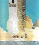
My modern version of Lichenstein, using computer tools of course! i204.photobucket.com/albums/bb184/ginniegatrit/apollo11-1.jpgI cheated on this one. I used pictures from the web, applied brightness and contrast, and ink effect. Took them to OpenDraw and arranged them. Balloon type text was taken directly from Journal transcripts PDF file, unmodified. Exported them from OpenDraw as jpeg. EDIT: I don't consider this as an example of my 'art' in any way. I consider it of an assembly of images more that anything. |
|
|
|
Post by echnaton on Jan 6, 2008 9:03:25 GMT -4
Nice work.
|
|
|
|
Post by BertL on Jan 6, 2008 9:55:56 GMT -4
It looks quite nice. However, the "ROARRR!!!" seems really out of place. It's the only thing in the picture that isn't... Lichtenstein-ed.
|
|
|
|
Post by Ginnie on Jan 6, 2008 19:02:25 GMT -4
It looks quite nice. However, the "ROARRR!!!" seems really out of place. It's the only thing in the picture that isn't... Lichtenstein-ed. I could have made it look more like his WHAAM! but OpenOfficeDraw is limited in its text abilities. And I was doing it quick. I'd actually like to see the other 31 pages of this comic now that I think of it. Anyone want to collaborate to produce a 32 page comic book version of the Apollo 11 Mission? ;D It would need a very good and knowledgeable writer. I could help assemble the graphics and text windows/balloons. If we used NASA images, would we face copyright issues? I would rely on the computer again - doing it by hand would be quite a big project. eDIT: I modified the text a bit on the graphic... |
|
|
|
Post by Ginnie on Jan 6, 2008 20:07:32 GMT -4
|
|
reynoldbot
Jupiter
A paper-white mask of evil.
Posts: 790
|
Post by reynoldbot on Jan 7, 2008 3:52:49 GMT -4
My modern version of Lichenstein, using computer tools of course! i204.photobucket.com/albums/bb184/ginniegatrit/apollo11-1.jpgI cheated on this one. I used pictures from the web, applied brightness and contrast, and ink effect. Took them to OpenDraw and arranged them. Balloon type text was taken directly from Journal transcripts PDF file, unmodified. Exported them from OpenDraw as jpeg. EDIT: I don't consider this as an example of my 'art' in any way. I consider it of an assembly of images more that anything. Compositionally this works pretty well, except that the right side is almost totally ignored throughout most of the page. If you'll notice, you could crop a considerable amount off of the right side and not lose hardly any information. Spread the elements out a little to both sides of the page and you've got yourself a nice composition. I have to hand it to you, I've certainly seen worse comic pages. MUCH worse. |
|
|
|
Post by Ginnie on Jan 7, 2008 19:14:26 GMT -4
Compositionally this works pretty well, except that the right side is almost totally ignored throughout most of the page. If you'll notice, you could crop a considerable amount off of the right side and not lose hardly any information
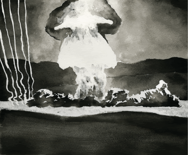
Hmm, I don't know about that. I think showing the smoke from the rockets blast is important. You get a better idea of the force involved to lift the rocket into space.
In fact, I especially like the picture of the Apollo 11 blastoff where the rocket is but a small portion of it - the smoke and blast itself takes up over half of the picture. I'd scan it in to show you but I'm in LInux right now and the Lexmark all-in-one Scanner doesn't work.
|
|
|
|
Post by Ginnie on Jan 7, 2008 19:34:17 GMT -4
I guess Windows does actually have a function... ;D Especially if the hardware works ONLY with Windows. Anyway, here is a link to one of my favourite Apollo shots: i204.photobucket.com/albums/bb184/ginniegatrit/apollo11Blast.jpgThe blast just looks so powerful! About seven and a half million pounds of thrust or something like that? (I'm sure I'll be corrected) I should change the main font on the 'cover' of the comic though, it makes it look really cheap! (EDIT: just changed it) Its funny though how some things look easier than they are. The placement of all the elements on a comic page is a very important task - one that I should stay away from or else learn to do properly. Also, the choice of text font and placement of 'balloons' can affect drastically the look of the page. I'm curious. The 'Kingwood Himself' comic that you presented here: what did you use to create it? Ink? Paint? |
|
|
|
Post by Ginnie on Jan 7, 2008 20:37:55 GMT -4
|
|
|
|
Post by BertL on Jan 8, 2008 10:43:23 GMT -4
What's the picture on the middle row in the left from?
|
|
|
|
Post by Ginnie on Jan 8, 2008 16:17:46 GMT -4
www.maniacworld.com/apollo_11_landing.jpgIt may in fact be out of sequence - I don't know if its a picture of the CM after the LM detached from it, or if it is the LM approaching it. It came out kind of blurry, but I did things quickly and didn't pay enough attention to the individual images. It's kind of a gag anyways... A good way to do the comic would be to include all reference numbers for the pictures, like AS11-40-5896 or whatever. Also, by using the Apollo Image Atlas I would imagine that you could make sure that the pictures are in the right order time wise. But it would be interesting to have a comic book explaining the Apollo 11 or other missions. Perhaps a one and a half inch stripe down the side ot each page could give details and technical information, while the rest of the page entertains and informs in comic book style. I don't have the necessary skills in writing it. And NASA would have to give permission I guess to use their photographs that way, even though they are public domain . Maybe it could be published as a web page even.
|
|
|
|
Post by BertL on Jan 8, 2008 17:28:56 GMT -4
It would certainly be a very interesting comic to read, ginnie. Especially if it was all made in the style of the last three pages. Man, I would definetly try to get my hands on that.
|
|
|
|
Post by Ginnie on Jan 8, 2008 17:50:51 GMT -4
|
|
reynoldbot
Jupiter
A paper-white mask of evil.
Posts: 790
|
Post by reynoldbot on Jan 8, 2008 19:49:15 GMT -4
Compositionally this works pretty well, except that the right side is almost totally ignored throughout most of the page. If you'll notice, you could crop a considerable amount off of the right side and not lose hardly any informationHmm, I don't know about that. I think showing the smoke from the rockets blast is important. You get a better idea of the force involved to lift the rocket into space. In fact, I especially like the picture of the Apollo 11 blastoff where the rocket is but a small portion of it - the smoke and blast itself takes up over half of the picture. I'd scan it in to show you but I'm in LInux right now and the Lexmark all-in-one Scanner doesn't work. I agree, including the smoke is pretty important, but I still contend that too much of the information on the page is constrained to the left side. There are a variety of ways to solve this problem that do not involve cropping the smoke out of the image. |
|
reynoldbot
Jupiter
A paper-white mask of evil.
Posts: 790
|
Post by reynoldbot on Jan 8, 2008 20:00:27 GMT -4
I use India Ink - specifically I use Higgens for linework and ph. martin's black star matte for filling in blacks and for anything not meant for reproduction. I use winsor & newton series 7 brushes for nearly all of my work (size 2 for lines size 5 for filling blacks), though I do use nibs occasionally for details and for ruled lines.
I like this page quite a bit. Compositionally it works very well, and the panel layout is smart and conservative. It allows the reader to focus on the story rather than the page design. I don't like the implementation of the bar of text in your redesign. It's too skinny and large portions of text are basically like roadblocks on a comic page. Spreading that same text out into the page, juxtaposed with some transcript dialogue, would complete the page nicely.
Specifically, I would put that text into boxes that run along the tops of the panels, then throw dialogue balloons into the panels to direct the reader's eye along the page. You want the reader to make smooth transitions between panels and tiers so they can efficiently make their way through the page.
|
|